plotPCA
Tool for generating a principal component analysis (PCA) plot from multiBamSummary or multiBigwigSummary output. Each sample is plotted at its score (projection) on the requested principal components.
Detailed help:
plotPCA -h
usage: plotPCA -in coverage.npz -o pca.png
help: plotPCA -h / plotPCA --help
Required arguments
- --corData, -in
Coverage file (generated by multiBamSummary or multiBigwigSummary)
Optional arguments
- --plotFile, -o
File name to save the plot to. The extension determines the file format. For example: pca.pdf will save the PCA plot in PDF format. The available options are: .png, .eps, .pdf and .svg. If this option is omitted, then you MUST specify –outFileNameData
- --labels, -l
User defined labels instead of default labels from file names. Multiple labels have to be separated by spaces, e.g. –labels sample1 sample2 sample3
- --plotTitle, -T
Title of the plot, to be printed on top of the generated image. Leave blank for no title. (Default: ‘’)
- --plotFileFormat
Possible choices: png, pdf, svg, eps
Image format type. If given, this option overrides the image format based on the plotFile ending. The available options are: png, eps, pdf and svg.
- --plotHeight
Plot height in cm. (Default: 10)
- --plotWidth
Plot width in cm. The minimum value is 1 cm. (Default: 12)
- --outFileNameData
File name to which the data underlying the plot should be saved, such as myPCA.tab. Rows are principal components and columns are each sample’s score (projection) on that component, followed by a column of eigenvalues.
- --ntop
Use only the top N most variable rows in the original matrix. Specifying 0 will result in all rows being used. The default is 500. (Default: 500)
- --PCs
The principal components to plot. If specified, you must provide two different integers, greater than zero, separated by a space. An example (and the default) is “1 2”. (Default: [1, 2])
- --log2
log2 transform the datapoints prior to computing the PCA. Note that 0.01 is added to all values to prevent 0 values from becoming -infinity. Using this option with input that contains negative values will result in an error.
- --colors
A list of colors for the symbols. Color names and RGB hex values (e.g., #eeff22) are accepted. The color names should be space separated. For example, –colors red blue green. Expanders can be passed with color:number, for example –colors red:3 blue:3 will produce [red, red, red, blue, blue, blue] values. If not specified, the symbols will be given automatic with rainbow colors.
- --markers
A list of markers for the symbols. (e.g., ‘<’,’>’,’o’) are accepted. The marker values should be space separated. For example, –markers ‘s’ ‘o’ ‘s’ ‘o’. Expanders can be passed with marker:number, for example –markers o:3 ws:3 ill produce [s, s, s, o, o, o] values. If not specified, the symbols will be only filled circles (‘o’).
- --addLabels
Add labels to the plot. If specified, the labels will be added next to points also legend is ommited.
- --version
show program’s version number and exit
- --ggplot
Use the ggplot theme for figures.
example usages: plotPCA -in coverages.npz -o pca.png
Background
Principal component analysis (PCA) can be used, for example, to determine whether samples display greater variability between experimental conditions than between replicates of the same treatment. PCA is also useful to identify unexpected patterns, such as those caused by batch effects or outliers. Principal components represent the directions along which the variation in the data is maximal, so that the information (e.g., read coverage values) from thousands of regions can be represented by just a few dimensions.
Note
PCA is not designed to identify unknown groupings or clustering and given an unexpected result, it is up to the researcher to determine the experimental or technical reason underlying the principal components.
Usage example
plotPCA needs the compressed numpy array output from either multiBamSummary or multiBigwigSummary
$ deepTools2.0/bin/plotPCA -in readCounts.npz \
-o PCA_readCounts.png \
-T "PCA of read counts"
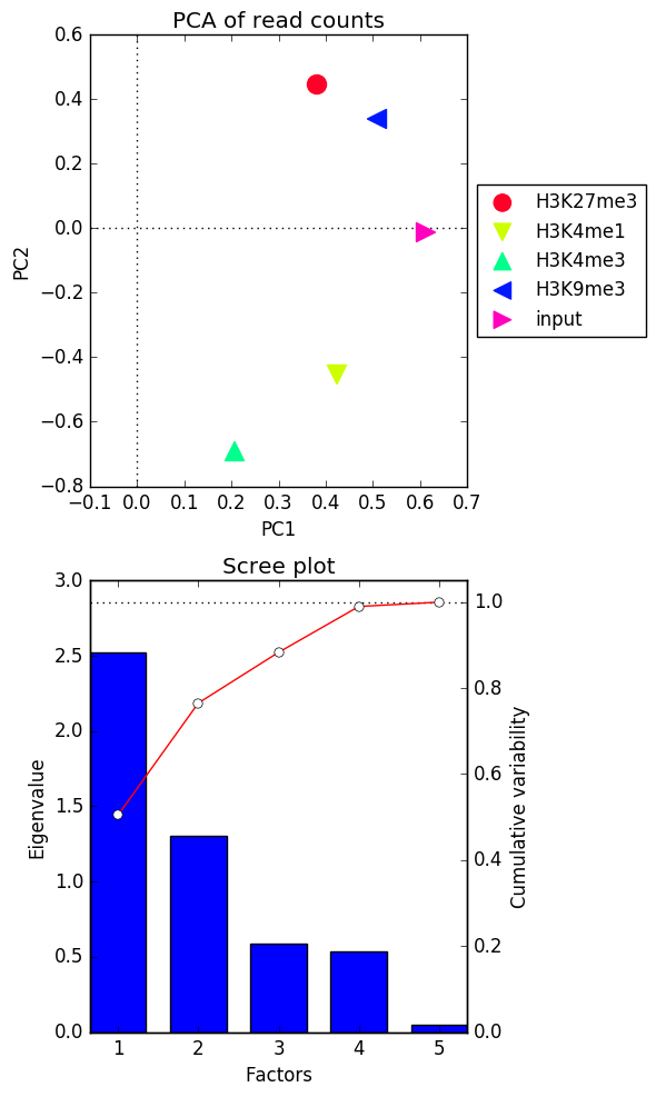
After perfoming the PCA on the values supplied as the input, plotPCA will sort the principal components according to the amount of variability of the data that they explain. Based on this, you will obtain two plots:
the eigenvalues of the top two principal components
the Scree plot for the top five principal components where the bars represent the amount of variability explained by the individual factors and the red line traces the amount of variability is explained by the individual components in a cumulative manner