plotHeatmap
Details
Note
With the release of deepTools 2.3 is is now possible to set the color and scale of each heatmap individually. Also, we added the option to remove the boxes around the heatmaps.
plotHeatmap does not change the values that computeMatrix calculated, it simply translates them into heatmaps and summary plots.
It offers a large variety of parameters to explore various visualizations and customize the resulting image (see the commands above).
In addition, you can retrieve all the data tables underlying the various plots including the regions that were used to generate the final plot. The following tables summarizes the kinds of optional outputs that are available with the three tools.
| optional output type | command | computeMatrix | plotHeatmap | plotProfile |
| values underlying the heatmap | --outFileNameMatrix |
yes | yes | no |
| values underlying the profile | --outFileNameData |
no | yes | yes |
| sorted and/or filtered regions | --outFileSortedRegions |
yes | yes | yes |
Tip
For more details on the optional output, see the examples for computeMatrix.
Usage examples
The following example creates a heatmap over hg19 transcripts for our test ENCODE datasets. Note that the matrix contains multiple groups of regions (in this case, one for each chromosome used).
# run compute matrix to collect the data needed for plotting
$ computeMatrix scale-regions -S H3K27Me3-input.bigWig \
                                 H3K4Me1-Input.bigWig  \
                                 H3K4Me3-Input.bigWig \
                              -R genes19.bed genesX.bed \
                              --beforeRegionStartLength 3000 \
                              --regionBodyLength 5000 \
                              --afterRegionStartLength 3000
                              --skipZeros -o matrix.mat.gz

$ plotHeatmap -m matrix.mat.gz \
      -out ExampleHeatmap1.png \
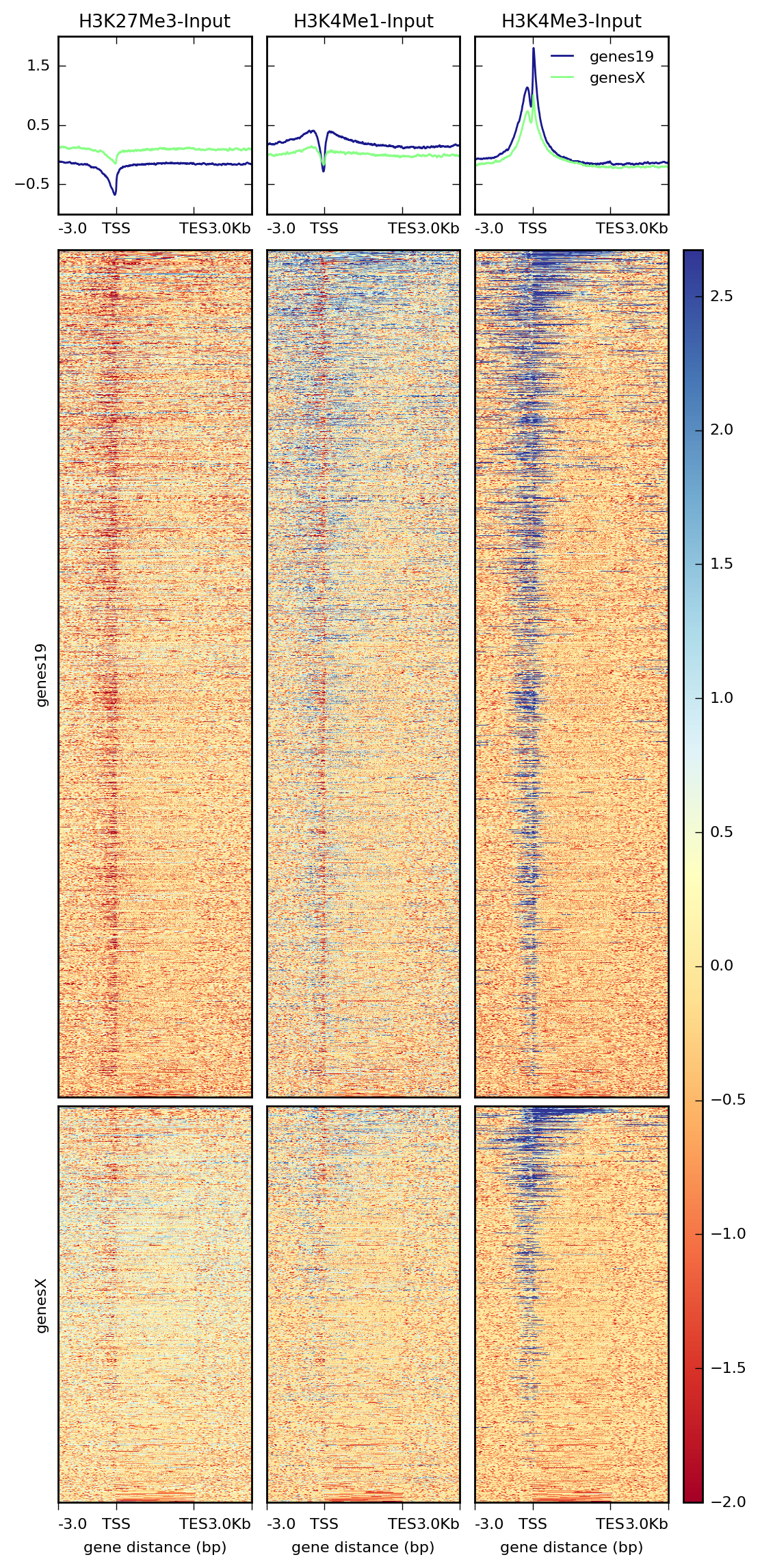
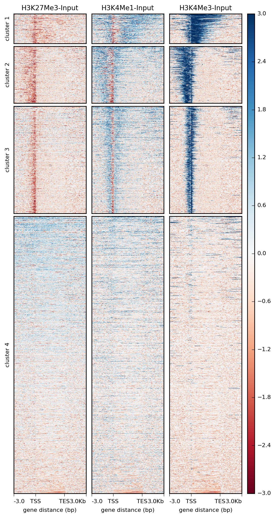
As mentioned above, plotHeatmap has many options, including the ability to do k-means clustering and change the color map.
$ plotHeatmap -m matrix_two_groups.gz \
     -out ExampleHeatmap2.png \
     --colorMap RdBu \
     --whatToShow 'heatmap and colorbar' \
     --zMin -3 --zMax 3 \
     --kmeans 4
Tip
More examples can be found in our Gallery.
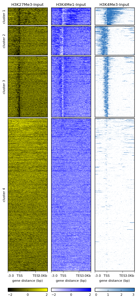
Multiple colors for heatmaps
Since deepTools version 2.3 it is now possible to adjust the color and scale of each heatmap. There are two ways to adjust the colors, one by specifying each of the colormaps (e.g. –colorMap RdBlGr winter terrain) and the other is by giving each of the colors in the heatmap (e.g. –colorList ‘red,blue’ ‘white,green’, ‘white, blue, red’). For the second example, the number of transitions between the colors is given by the –colorNumber which by default is 256.
The following is an example using the –colorList method is used. Also the scale of each heatmap is modified using –zMin and –zMax.
$ plotHeatmap -m matrix_two_groups.gz \
     -out ExampleHeatmap3.png \
     --colorList 'black, yellow' 'white,blue' '#ffffff,orange,#000000'
     --whatToShow 'heatmap and colorbar' \
     --zMin -2 -2 0 --zMax 2 2 3
     --kmeans 4
     --dpi 100
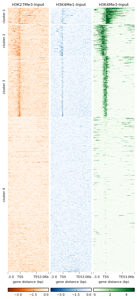
No box around heatmaps
In version 2.3 we also added the option to remove the box around heatmaps. In the following example we combine different colormap colors, different scales and the new –boxAroundHeatmaps option.
$ plotHeatmap -m matrix_two_groups.gz \
     -out ExampleHeatmap4.png \
     --colorMap Oranges_r Blues_r Greens
     --whatToShow 'heatmap and colorbar' \
     --zMin -4 -4 0 --zMax 0 0 5
     --kmeans 4
     --dpi 100
     --boxAroundHeatmaps no
Tip
More examples can be found in our Gallery.
| deepTools Galaxy. | code @ github. |