plotCorrelation
Tool for the analysis and visualization of sample correlations based on the output of multiBamSummary or multiBigwigSummary. Pearson or Spearman methods are available to compute correlation coefficients. Results can be saved as multiple scatter plots depicting the pairwise correlations or as a clustered heatmap, where the colors represent the correlation coefficients and the clusters are joined using the Nearest Point Algorithm (also known as “single”). Optionally, the values can be saved as tables, too.
detailed help:
plotCorrelation -h
usage: plotCorrelation [-h] --corData FILE --corMethod {spearman,pearson}
                       --whatToPlot {heatmap,scatterplot} [--plotFile FILE]
                       [--skipZeros]
                       [--labels sample1 sample2 [sample1 sample2 ...]]
                       [--plotTitle PLOTTITLE] [--plotFileFormat FILETYPE]
                       [--removeOutliers] [--version]
                       [--outFileCorMatrix FILE] [--plotHeight PLOTHEIGHT]
                       [--plotWidth PLOTWIDTH] [--zMin ZMIN] [--zMax ZMAX]
                       [--colorMap] [--plotNumbers] [--xRange XRANGE XRANGE]
                       [--yRange YRANGE YRANGE] [--log1p]
Required arguments
| --corData, -in | Compressed matrix of values generated by multiBigwigSummary or multiBamSummary |
| --corMethod, -c | |
Possible choices: spearman, pearson Correlation method. | |
| --whatToPlot, -p | |
Possible choices: heatmap, scatterplot Choose between a heatmap or pairwise scatter plots | |
Optional arguments
| --plotFile, -o | File to save the heatmap to. The file extension determines the format, so heatmap.pdf will save the heatmap in PDF format. The available formats are: .png, .eps, .pdf and .svg. |
| --skipZeros | By setting this option, genomic regions that have zero or missing (nan) values in all samples are excluded. |
| --labels, -l | User defined labels instead of default labels from file names. Multiple labels have to be separated by spaces, e.g. –labels sample1 sample2 sample3 |
| --plotTitle, -T | |
| Title of the plot, to be printed on top of the generated image. Leave blank for no title. | |
| --plotFileFormat | |
Possible choices: png, pdf, svg, eps, plotly Image format type. If given, this option overrides the image format based on the plotFile ending. The available options are: png, eps, pdf and svg. | |
| --removeOutliers | |
| If set, bins with very large counts are removed. Bins with abnormally high reads counts artificially increase pearson correlation; that’s why, multiBamSummary tries to remove outliers using the median absolute deviation (MAD) method applying a threshold of 200 to only consider extremely large deviations from the median. The ENCODE blacklist page (https://sites.google.com/site/anshulkundaje/projects/blacklists) contains useful information about regions with unusually high countsthat may be worth removing. | |
| --version | show program’s version number and exit |
Output optional options
| --outFileCorMatrix | |
| Save matrix with pairwise correlation values to a tab-separated file. | |
Heatmap options
| --plotHeight | Plot height in cm. |
| --plotWidth | Plot width in cm. The minimum value is 1 cm. |
| --zMin, -min | Minimum value for the heatmap intensities. If not specified, the value is set automatically |
| --zMax, -max | Maximum value for the heatmap intensities.If not specified, the value is set automatically |
| --colorMap | Color map to use for the heatmap. Available values can be seen here: http://matplotlib.org/examples/color/colormaps_reference.html |
| --plotNumbers | If set, then the correlation number is plotted on top of the heatmap. This option is only valid when plotting a heatmap. |
Scatter plot options
| --xRange | The X axis range. The default scales these such that the full range of dots is displayed. |
| --yRange | The Y axis range. The default scales these such that the full range of dots is displayed. |
| --log1p | Plot the natural log of the scatter plot after adding 1. Note that this is ONLY for plotting, the correlation is unaffected. |
example usages: plotCorrelation -in results_file –whatToPlot heatmap –corMethod pearson -o heatmap.png
Background
plotCorrelation computes the overall similarity between two or more files based on read coverage (or other scores) within genomic regions, which must be calculated using either multiBamSummary or multiBigwigSummary.
Correlation calculation
The result of the correlation computation is a table of correlation coefficients that indicates how “strong” the relationship between two samples is and it will consist of numbers between -1 and 1. (-1 indicates perfect anti-correlation, 1 perfect correlation.)
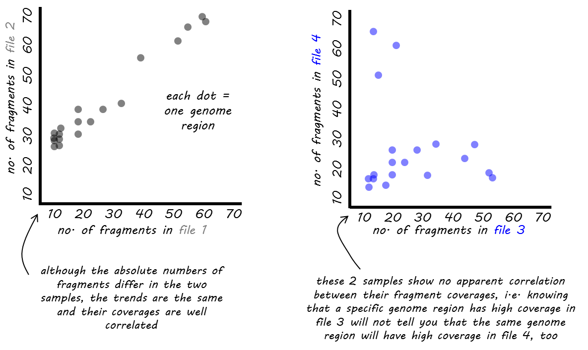
We offer two different functions for the correlation computation: Pearson or Spearman.
The Pearson method measures the metric differences between samples and is therefore influenced by outliers. More precisely, it is defined as the covariance of two variables divided by the product of their standard deviation.
The Spearman method is based on rankings. If you imagine a race with 3 participants where the winner and runner-up are very close together while the third person broke her leg and comes in way, way after the first two, then Pearson would be strongly influenced by the fact that the third person had a great distance to the first ones while Spearman would only care about the fact that person 1 came in first, person 2 came in second and person 3 got the third rank, the distances between them are ignored.
Tip
Pearson is an appropriate measure for data that follows a normal distribution, while Spearman does not make this assumption and is generally less driven by outliers, but with the caveat of also being less sensitive.
Hierarchical clustering
If you use the heatmap output of plotCorrelation, this will automatically lead to a clustering of the samples based on the correlation coefficients. This helps to determine whether the different sample types can be separated, i.e., samples of different conditions are expected to be more dissimilar to each other than replicates within the same condition.
The distances of the sample pairs are based on the correlation coefficients, r, where distance = 1 - r. The similarity of the samples is assessed using the nearest point algorithm, i.e., the shortest distance between any 2 members of the tree is considered to decide whether to join a cluster or not. For more details of the algorithm, go here.
Examples
Here’s an example of RNA-seq data from different human cell lines that we had downloaded from https://genome.ucsc.edu/ENCODE/dataMatrix/encodeDataMatrixHuman.html.
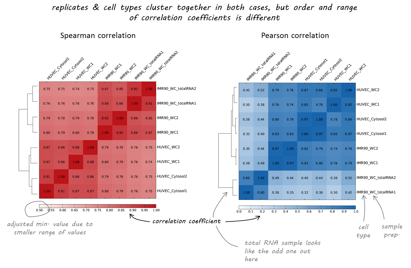
As you can see, both correlation calculations more or less agree on which samples are nearly identical (the replicates, indicated by 1 or 2 at the end of the label). The Spearman correlation, however, seems to be more robust and meets our expectations more closely as the two different cell types (HUVEC and IMR90) are clearly separated.
In the following example, a correlation analysis is performed based on the coverage file computed by multiBamSummary or multiBigwigSummary for our test ENCODE ChIP-Seq datasets.
Scatterplot
Here we make pairwose scatterplots of the average scores per transcript that we calculated using multiBigwigSummary and include the Pearson correlation coefficients for each comparison.
$ deepTools2.0/bin/plotCorrelation \
-in scores_per_transcript.npz \
--corMethod pearson --skipZeros \
--plotTitle "Pearson Correlation of Average Scores Per Transcript" \
--whatToPlot scatterplot \
-o scatterplot_PearsonCorr_bigwigScores.png   \
--outFileCorMatrix PearsonCorr_bigwigScores.tab
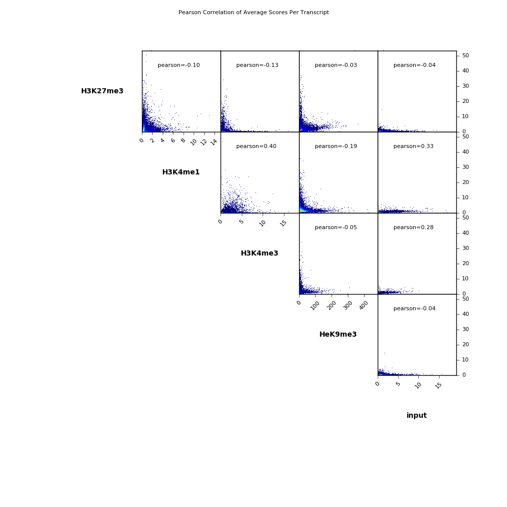
$ cat PearsonCorr_bigwigScores.tab
    'H3K27me3'      'H3K4me1'       'H3K4me3'       'HeK9me3'       'input'
    'H3K27me3'      1.0000  -0.1032 -0.1269 -0.0339 -0.0395
    'H3K4me1'       -0.1032 1.0000  0.3985  -0.1863 0.3328
    'H3K4me3'       -0.1269 0.3985  1.0000  -0.0480 0.2822
    'HeK9me3'       -0.0339 -0.1863 -0.0480 1.0000  -0.0353
    'input' -0.0395 0.3328  0.2822  -0.0353 1.0000
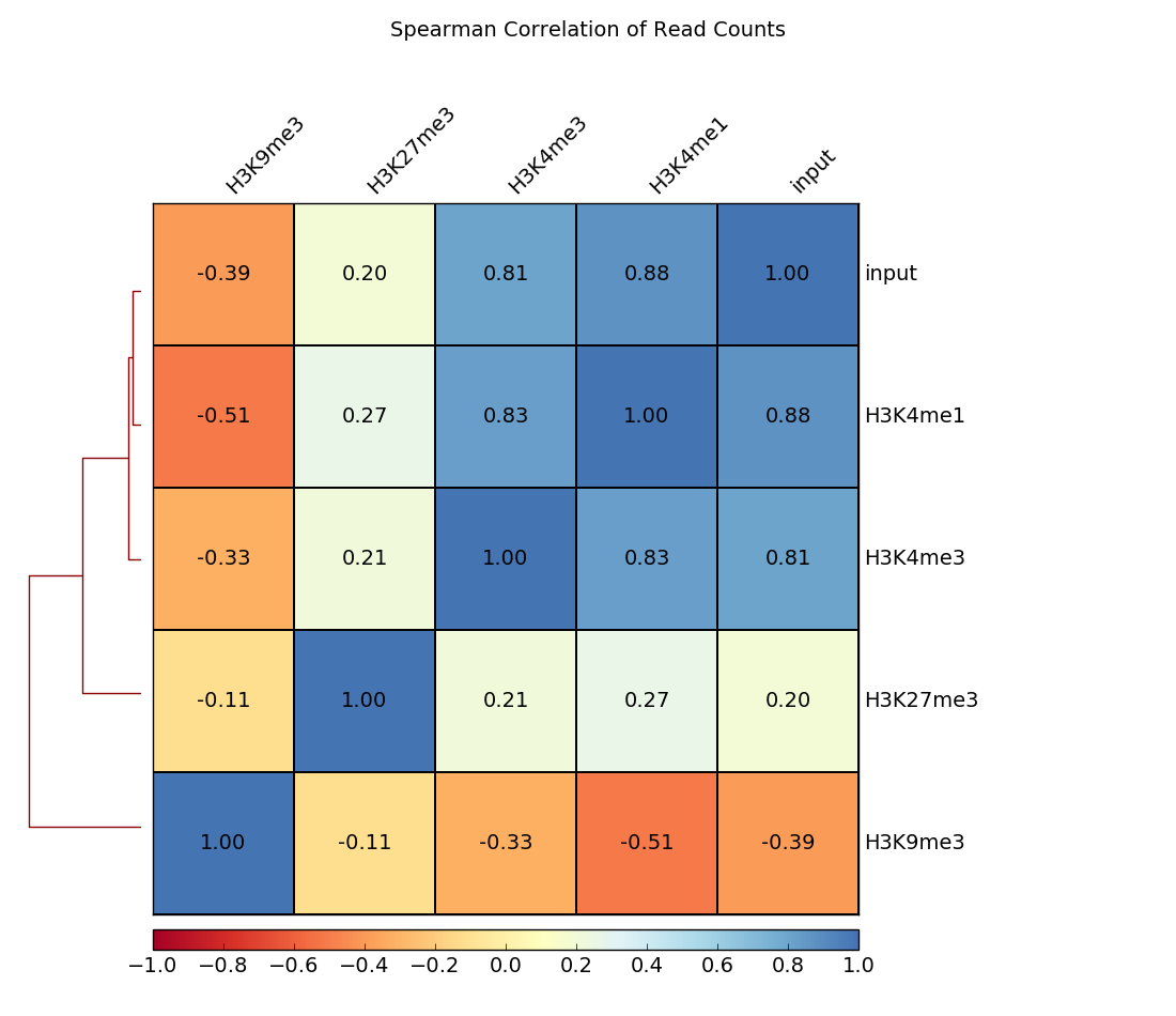
Heatmap
In addition to scatterplots, heatmaps can be generated where the pairwise correlation coefficients are depicted by varying color intensities and are clustered using hierarchical clustering.
The example here calculates the Spearman correlation coefficients of read counts. The dendrogram indicates which samples’ read counts are most similar to each other.
$ deepTools2.0/bin/plotCorrelation \
    -in readCounts.npz \
    --corMethod spearman --skipZeros \
    --plotTitle "Spearman Correlation of Read Counts" \
    --whatToPlot heatmap --colorMap RdYlBu --plotNumbers \
    -o heatmap_SpearmanCorr_readCounts.png   \
    --outFileCorMatrix SpearmanCorr_readCounts.tab
| deepTools Galaxy. | code @ github. |