Gallery of deepTools plots
We’re trying to collect a wide variety of plots generated using deepTools. For the plots that we created ourselves, we try to point out the options that were used to create each image, so perhaps these can serve as inspiration for you.
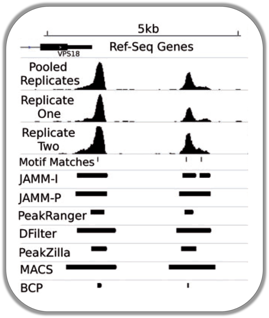
Normalized ChIP-seq signals and peak regions
This image was published by Ibrahim et al., 2014 (NAR). They used deepTools to generate extended reads per kilobase per million reads at 10 base resolution and visualized the resulting coverage files in IGV.
DNase accessibility at enhancers in murine ES cells
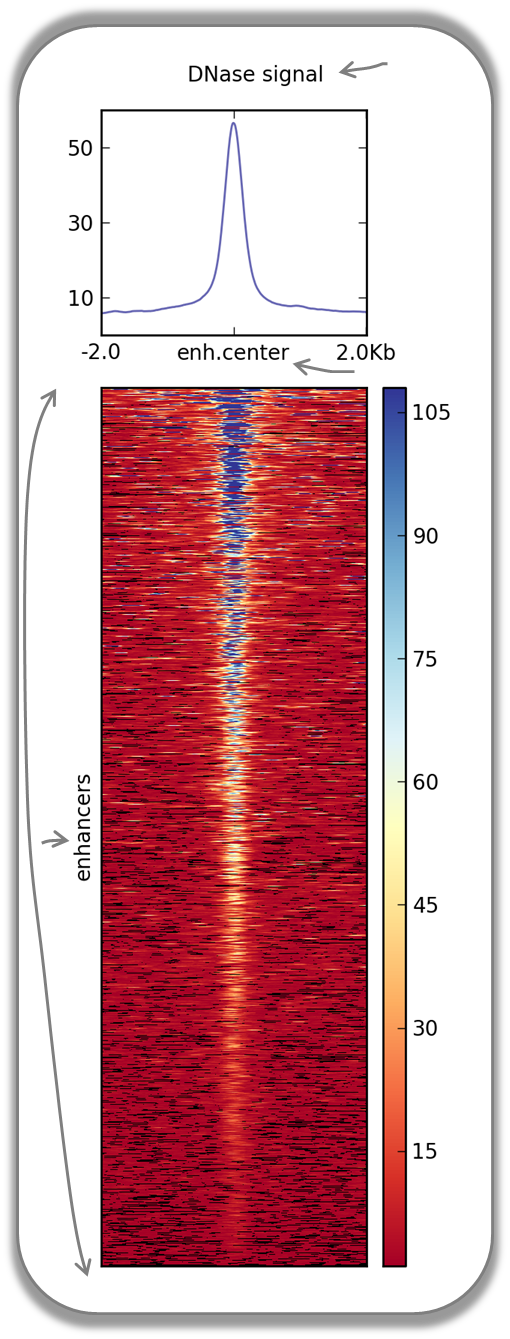
The following image demonstrates that enhancer regions are typically small stretches of highly accessible chromatin (more information on enhancers can be found, for example, here). In the heatmap, yellow and blue tiles indicate a large numbers of reads that were sequenced (indicative of open chromatin) and black spots indicate missing data points. An appropriate labeling of the y-axis was neglected.
Fast Facts:
computeMatrix mode: reference-point
regions file: BED file with typical enhancer regions from Whyte et al., 2013 (download here)
signal file: bigWig file with DNase signal from UCSC
heatmap cosmetics: labels, titles, heatmap height
Command:
$ computeMatrix reference-point \
 -S DNase_mouse.bigwig \
 -R Whyte_TypicalEnhancers_ESC.bed \
 --referencePoint center \
 -a 2000 -b 2000 \ ## regions before and after the enhancer centers
 -out matrix_Enhancers_DNase_ESC.tab.gz

$ plotHeatmap \
 -m matrix_Enhancers_DNase_ESC.tab.gz\
 -out hm_DNase_ESC.png \
 --heatmapHeight 15  \
 --refPointLabel enh.center \
 --regionsLabel enhancers \
 --plotTitle 'DNase signal' \
TATA box enrichments around the TSS of mouse genes
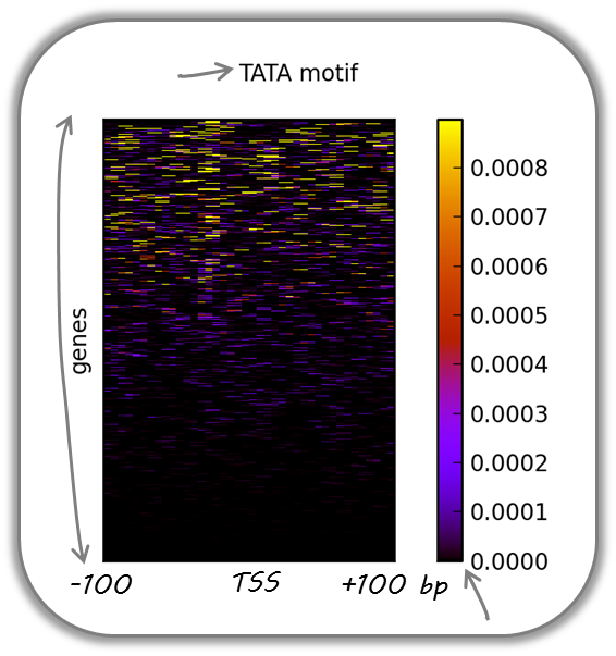
Using the TRAP suite, we produced a bigWig file that contained TRAP scores for the well-known TATA box motif along the mouse genome. The TRAP score is a measure for the strength of a protein-DNA interaction at a given DNA sequence; the higher the score, the closer the motif is to the consensus motif sequence. The following heatmap demonstrates that:
TATA-like motifs occur quite frequently
there is an obvious clustering of TATA motifs slightly upstream of the TSS of many mouse genes
there are many genes that do not contain TATA-like motifs at their promoter
Note that the heatmap shows all mouse RefSeq genes, so ca. 15,000 genes!
Fast Facts:
computeMatrix mode: reference-point
regions file: BED file with all mouse genes (from UCSC table browser)
signal file: bigWig file of TATA psem scores
heatmap cosmetics: color scheme, labels, titles, heatmap height, only showing heatmap + colorbar
Command:
$ computeMatrix reference-point \
 -S TATA_01_pssm.bw \
 -R RefSeq_genes.bed \
 --referencePoint TSS \
 -a 100 -b 100 \
 --binSize 5 \

$ plotHeatmap \
 -m matrix_Genes_TATA.tab.gz  \
 -out hm_allGenes_TATA.png \
 --colorMap hot_r \
 --missingDataColor .4 \
 --heatmapHeight 7 \
 --plotTitle 'TATA motif' \
 --whatToShow 'heatmap and colorbar' \
 --sortRegions ascend
Visualizing the GC content for mouse and fly genes
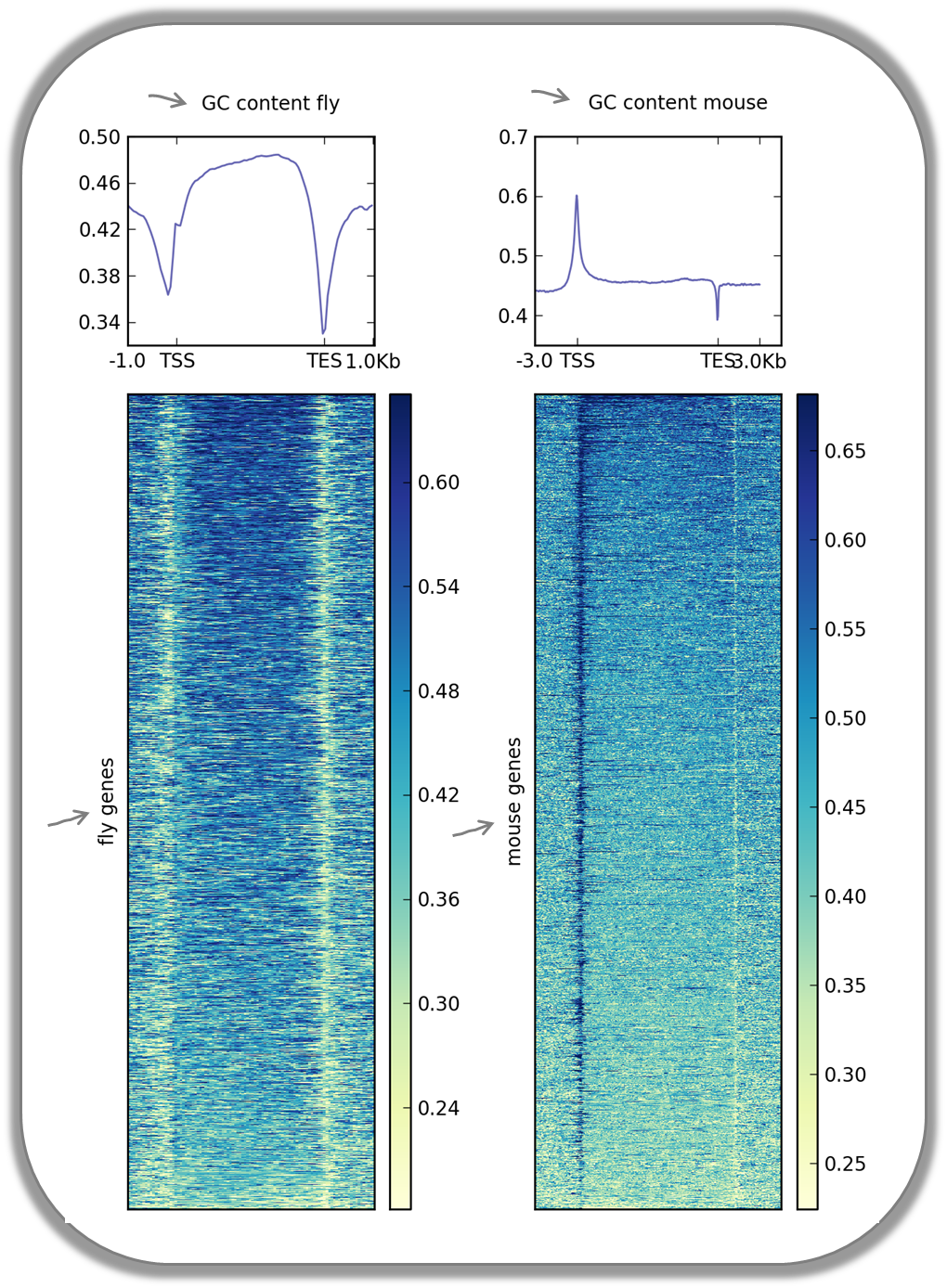
It is well known that different species have different genome GC contents. Here, we used two bigWig files where the GC content was calculated for 50 base windows along the genome of mice and flies and the resulting scores visualized for gene regions.
The images nicely illustrate the completely opposite GC distributions in flies and mice: while the gene starts of mammalian genomes are enriched for Gs and Cs, fly promoters show depletion of GC content.
Fast Facts |
|
|---|---|
computeMatrix mode |
scale-regions |
regions files |
BED files with mouse and fly genes (from UCSC table browser) |
signal file |
bigwig files with GC content |
heatmap cosmetics |
color scheme, labels, titles, color for missing data was set to white, heatmap height |
Fly and mouse genes were scaled to different sizes due to the different median sizes of the two species’ genes (genes of D.melanogaster contain many fewer introns and are considerably shorter than mammalian genes). Thus, computeMatrix had to be run with slightly different parameters while the plotHeatmap commands were virtually identical (except for the labels).
$ computeMatrix scale-regions \
 -S GCcontent_Mm9_50_5.bw \
 -R RefSeq_genes_uniqNM.bed \
 -bs 50
 -m 10000 -b 3000 -a 3000 \
 -out matrix_GCcont_Mm9_scaledGenes.tab.gz \
 --skipZeros \
 --missingDataAsZero

$ computeMatrix scale-regions \
 -S GCcontent_Dm3_50_5.bw \
 -R Dm530.genes.bed \
 -bs 50
 -m 3000 -b 1000 -a 1000 \
 -out matrix_GCcont_Dm3_scaledGenes.tab.gz \
 --skipZeros --missingDataAsZero

$ plotHeatmap \
 -m matrix_GCcont_Dm3_scaledGenes.tab.gz \
 -out hm_GCcont_Dm3_scaledGenes.png \
 --colorMap YlGnBu \
 --regionsLabel 'fly genes' \
 --heatmapHeight 15 \
 --plotTitle 'GC content fly' &

$ plotHeatmap \
 -m matrix_GCcont_Mm9_scaledGenes.tab.gz \
 -out hm_GCcont_Mm9_scaledGenes.png \
 --colorMap YlGnBu \
 --regionsLabel 'mouse genes' \
 --heatmapHeight 15 \
 --plotTitle 'GC content mouse' &
CpG methylation around murine transcription start sites in two different cell types
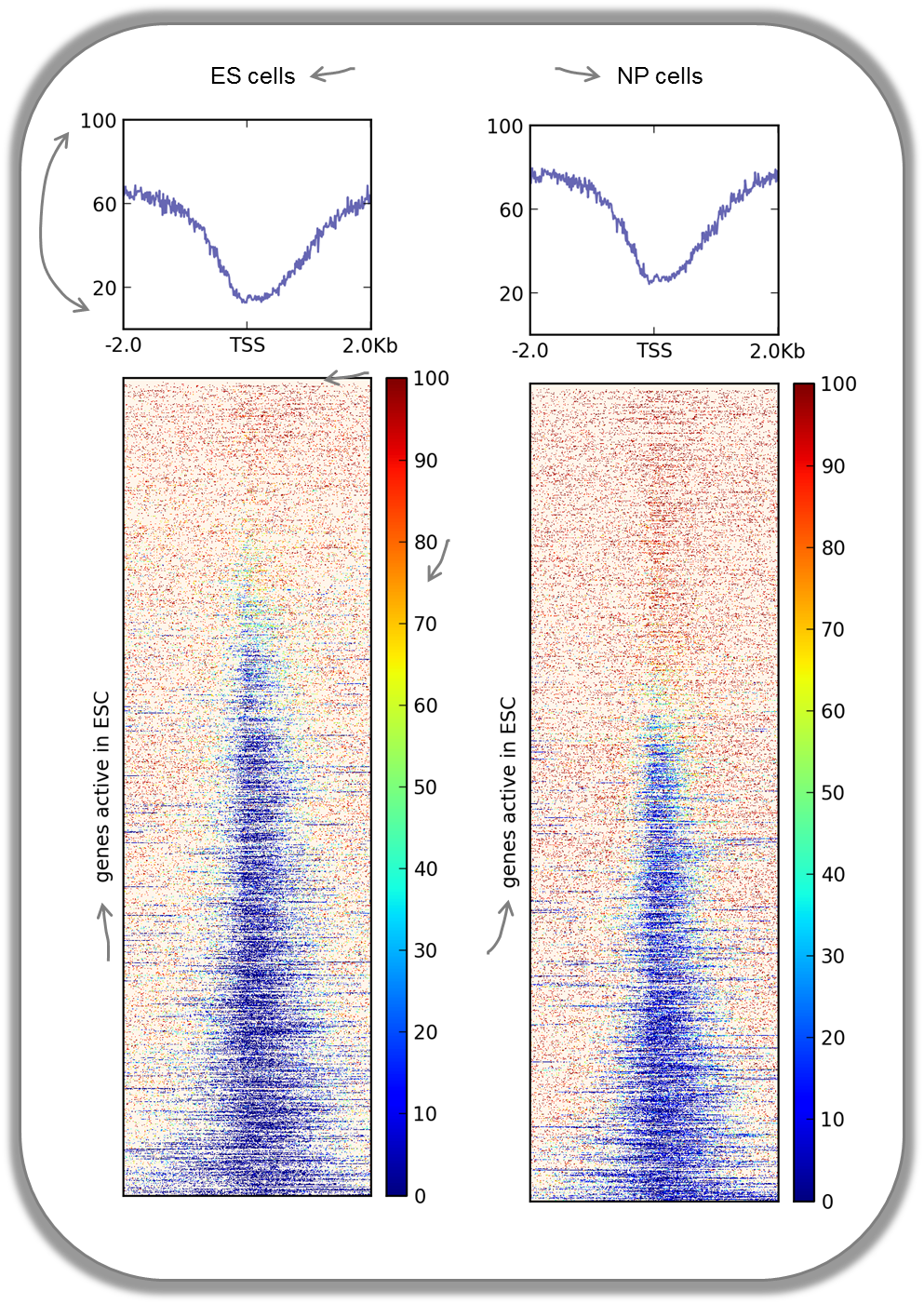
In addition to the methylation of histone tails, the cytosines can also be methylated (for more information on CpG methylation, read here). In mammalian genomes, most CpGs are methylated unless they are in gene promoters that need to be kept unmethylated to allow full transcriptional activity. In the following heatmaps, we used genes expressed primarily in ES cells and checked the percentages of methylated cytosines around their transcription start sites. The blue signal indicates that very few methylated cytosines are found. When you compare the CpG methylation signal between ES cells and neuronal progenitor (NP) cells, you can see that the majority of genes remain unmethylated, but the general amount of CpG methylation around the TSS increases, as indicated by the stronger red signal and the slight elevation of the CpG methylation signal in the summary plot. This supports the notion that genes stored in the BED file indeed tend to be more expressed in ES than in NP cells.
This image was taken from Chelmicki & Dündar et al. (2014), eLife.
Fast Facts |
|
|---|---|
computeMatrix mode |
reference-point |
regions files |
BED file mouse genes expressed in ES cells |
signal file |
bigWig files with fraction of methylated cytosins (from Stadler et al., 2011) |
heatmap cosmetics |
color scheme, labels, titles, color for missing data was set to customized color, y-axis of profiles were changed, heatmap height |
The commands for the bigWig files from the ES and NP cells were the same:
$ computeMatrix reference-point \
 -S GSE30202_ES_CpGmeth.bw \
 -R activeGenes_ESConly.bed \
 --referencePoint TSS \
 -a 2000 -b 2000 \
 -out matrix_Genes_ES_CpGmeth.tab.gz

$ plotHeatmap \
 -m matrix_Genes_ES_CpGmeth.tab.gz \
 -out hm_activeESCGenes_CpG_ES_indSort.png \
 --colorMap jet \
 --missingDataColor "#FFF6EB" \
 --heatmapHeight 15 \
 --yMin 0 --yMax 100 \
 --plotTitle 'ES cells' \
 --regionsLabel 'genes active in ESC'
Histone marks for genes of the mosquito Anopheles gambiae
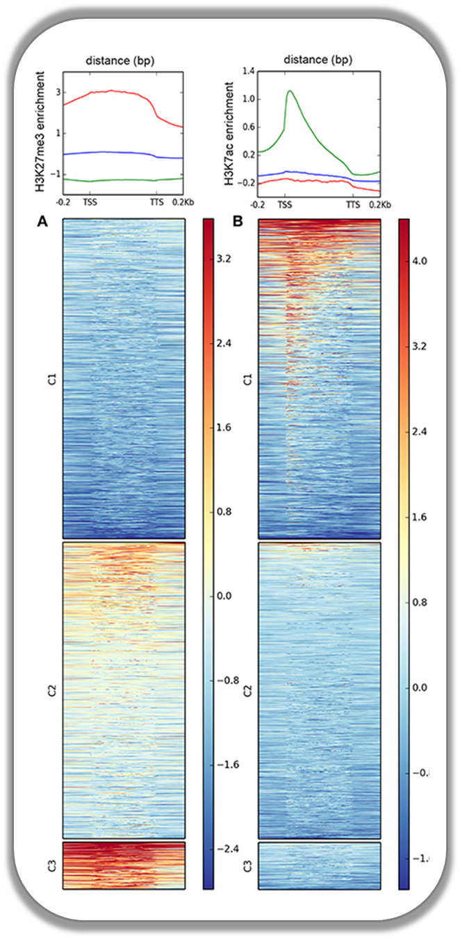
This figure was taken from Gómez-Díaz et al. (2014): Insights into the epigenomic landscape of the human malaria vector *Anopheles gambiae*. From Genet Aug15;5:277. It shows the distribution of H3K27Me3 (left) and H3K27Ac (right) over gene features in A. gambiae midguts. The enrichment or depletion is shown relative to chromatin input. The regions in the map comprise gene bodies flanked by a segment of 200 bases at the 5′ end of TSSs and TTSs. Average profile across gene regions ±200 bases for each histone modification are shown on top.
Signals of repressive chromatin marks, their enzymes and repeat element conservation scores
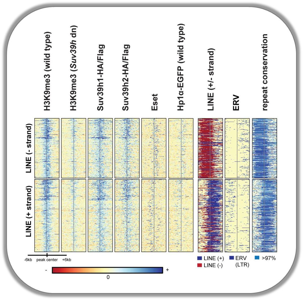
This image is from Bulut-Karsliogu and De La Rosa-Velázquez et al. (2014), Mol Cell. The heatmaps depict various signal types for unscaled peak regions of proteins and histone marks associated with repressed chromatin. The peaks were separated into those containing long interspersed elements (LINEs) on the forward and reverse strand. The signals include normalized ChIP-seq signals for H3K9Me3, Suv39h1, Suv39h2, Eset, and HP1alpha-EGFP, followed by LINE and ERV content and repeat conservation scores.
